Branding + Product Design + Illustration
Chicago Cannabis Company
A cannabis co-op based in Chicago that produces high quality hemp-derived products. Their brick-and-mortar is located in Chicago’s Lincoln Park neighborhood.
-
Soft Rebrand
Market Research
Product Design
Illustration
Logo System
Color Palette
Branded Assets

objective
Chicago Cannabis Company, or CCC, approached us about rebranding their flagship product lines. They wanted to create something bold, unique and, of course, attractive. This startup at the time had DIY-ed themselves a solid foundation to build from. We were tasked with coming in, improving what they had already done and collaborating on each product line.
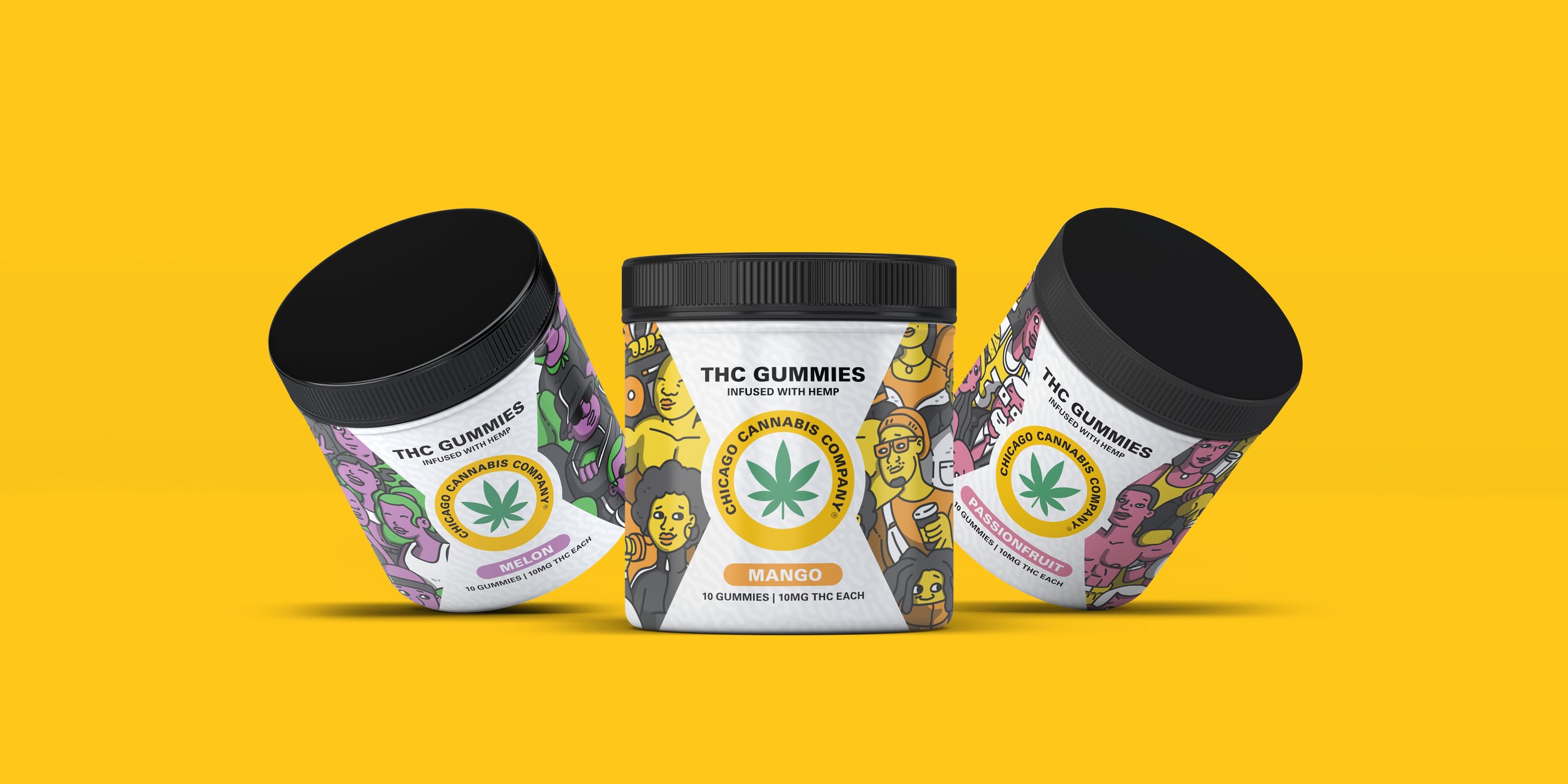
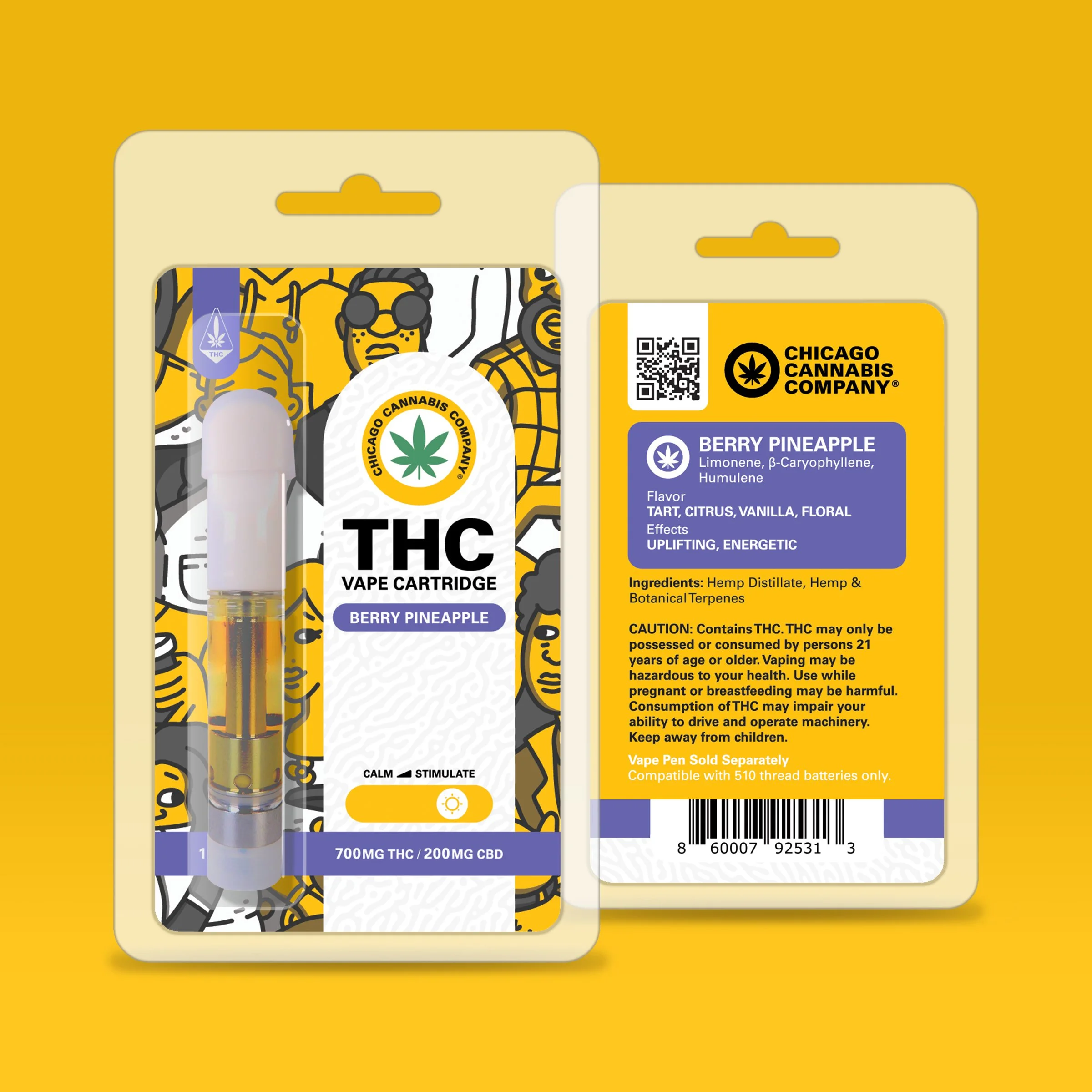
The biggest challenge with this branding project was creating unique product lines that differed from each other, yet still complimented. We wanted each product set to have a distinct personality in order to attract the different markets of cannabis consumers.

development
We started this project with a soft rebrand. We took CCC’s existing logos and color palette and optimized it for both print and digital to increase its versatility. We also developed a logo system that included a condensed logo and logo mark aside from their revamped primary logo.
Once we finished with the company wide branding and created a brand book, we were ready to tackle each product line. We did market research on viable markets and catered each product line accordingly. The CBD gummies were created with the casual cannabis user, while the THC vape collection was catered more towards avid users. Despite having these clear markets in mind, we wanted to make sure each product group felt approachable and friendly by any consumer. With Hi—Format’s signature illustration aesthetic as the backbone, we created beautiful packaging, storefront wraps, digital displays and many other touchpoints that have been turning heads since.


