Breathe Easy
Breathe Easy is a cannabis community built on quality, safety, and real human connection. Now they have a brand identity that shows up as hard as they do. They kept the "culture" in cannabis while looking waaaay more fresh than most dispensaries out there. What used to be a random assortment of flyers and menus became a brand identity that feels alive, welcoming, and unmistakably theirs.
Brand Identity
Creative Direction: Javier Suarez
Design: Javier Suarez


When the Breathe Easy team came to me, they had a vision for something different in the cannabis space. They weren't interested in being another impersonal corporate cannabis company, but their branding told a different story: inconsistent flyers and flower menus that didn't reflect the care they put into everything else.
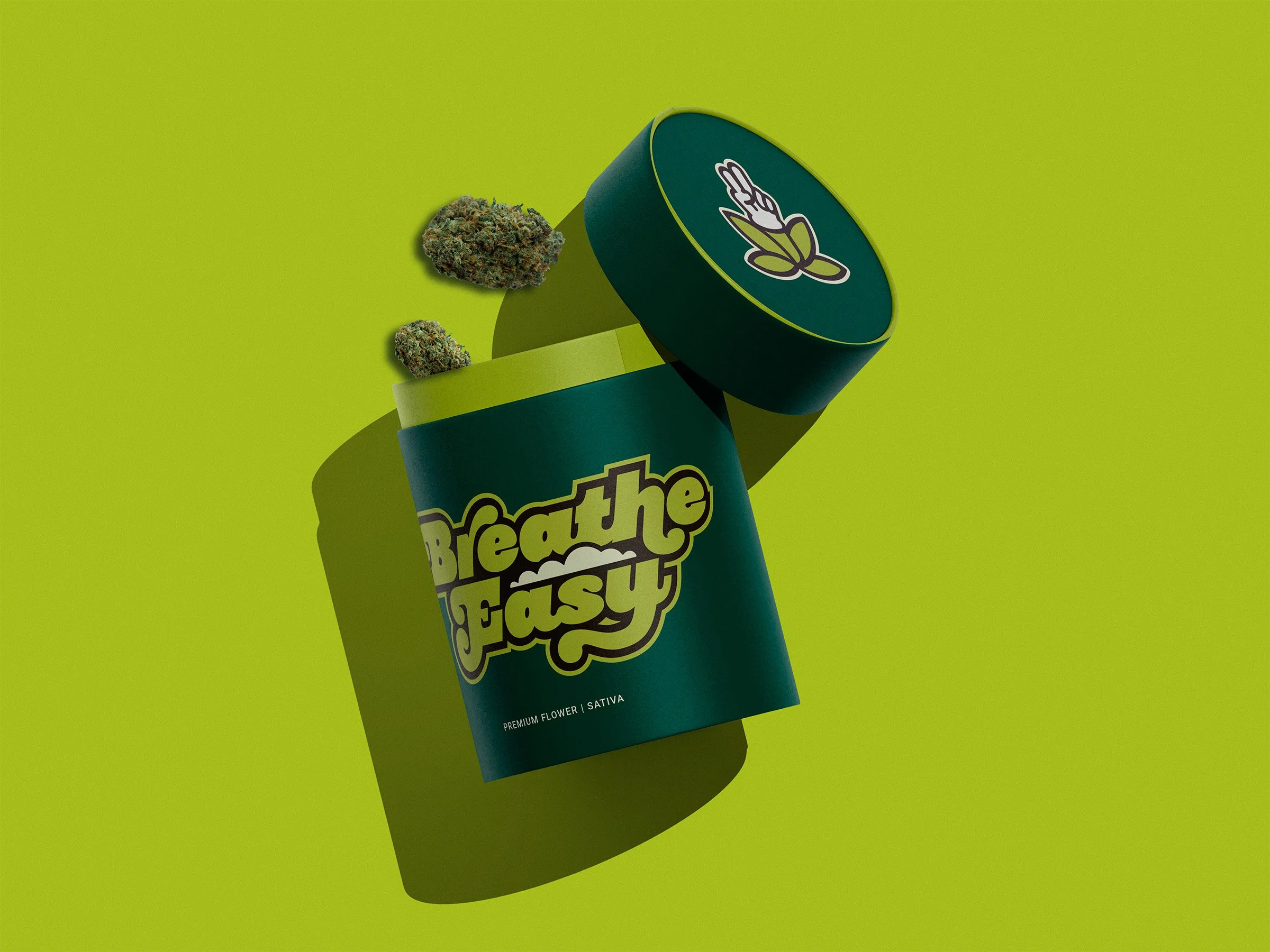
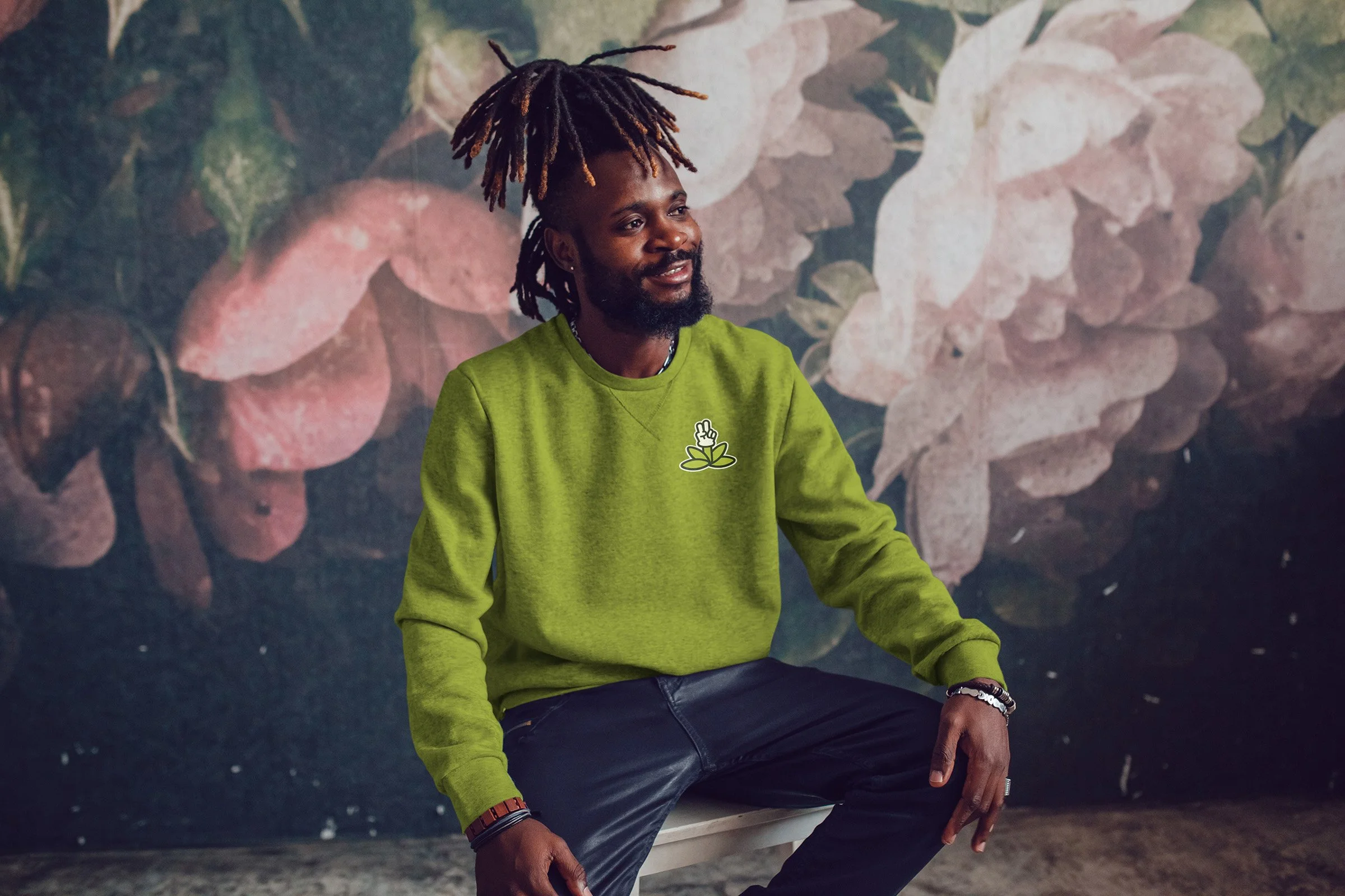
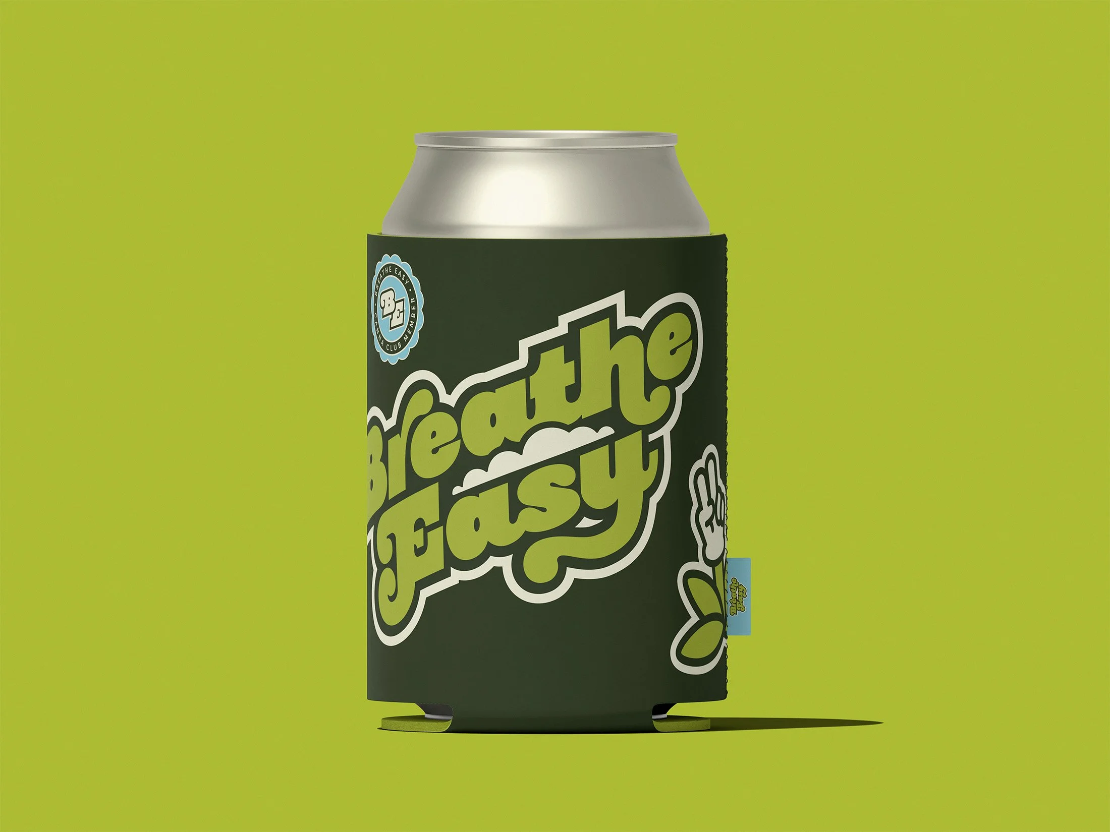
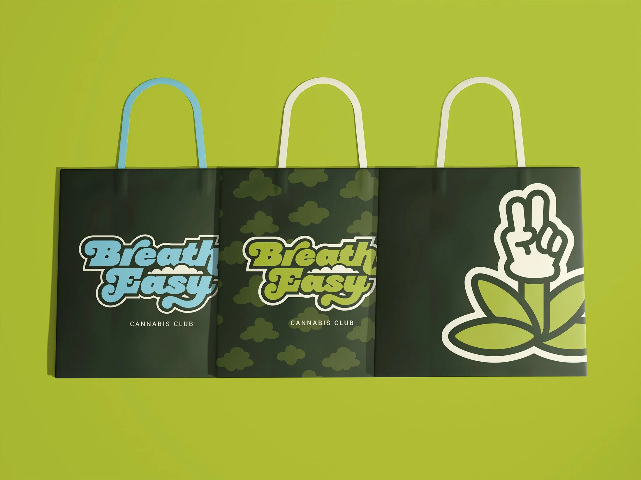
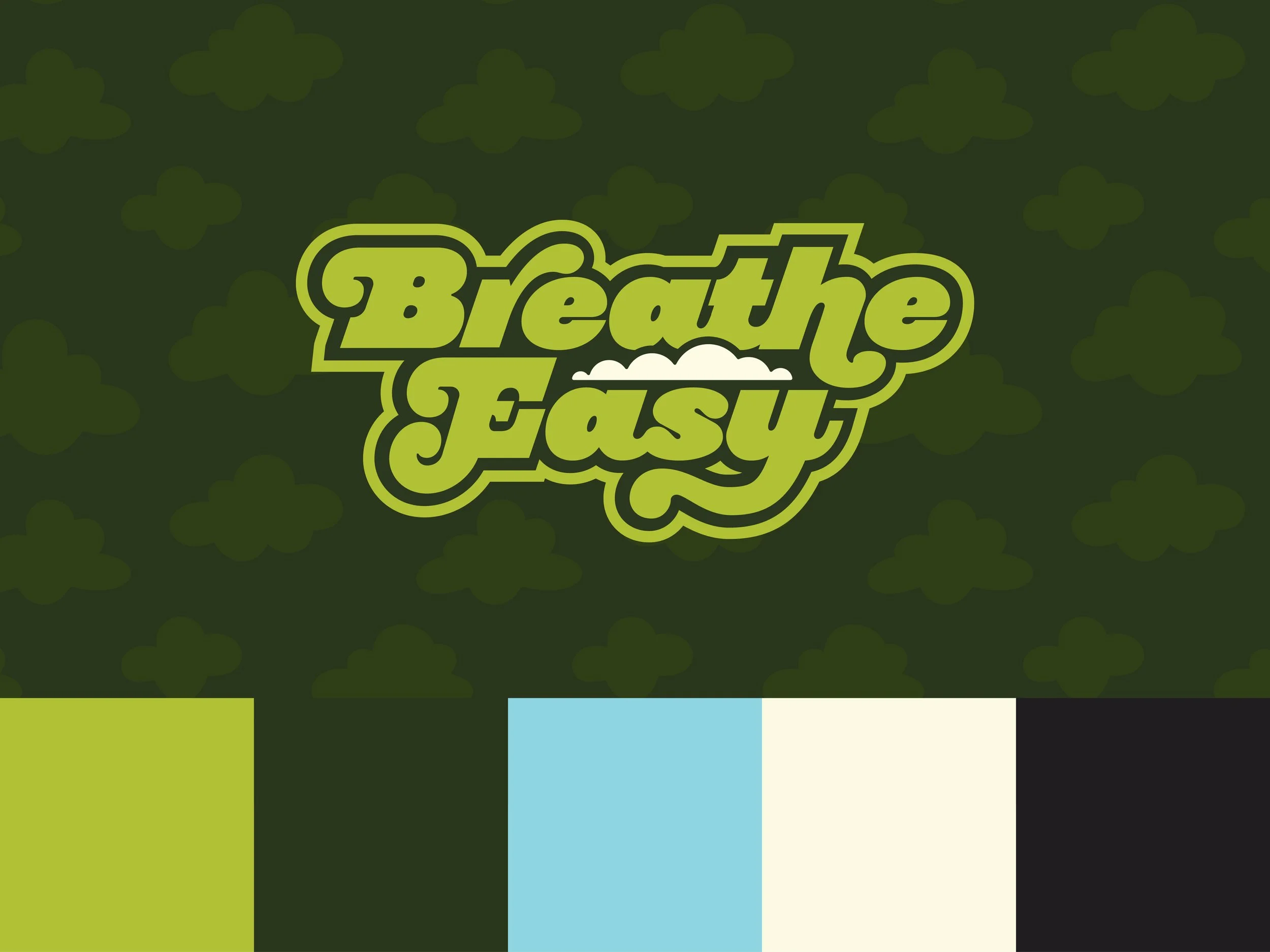
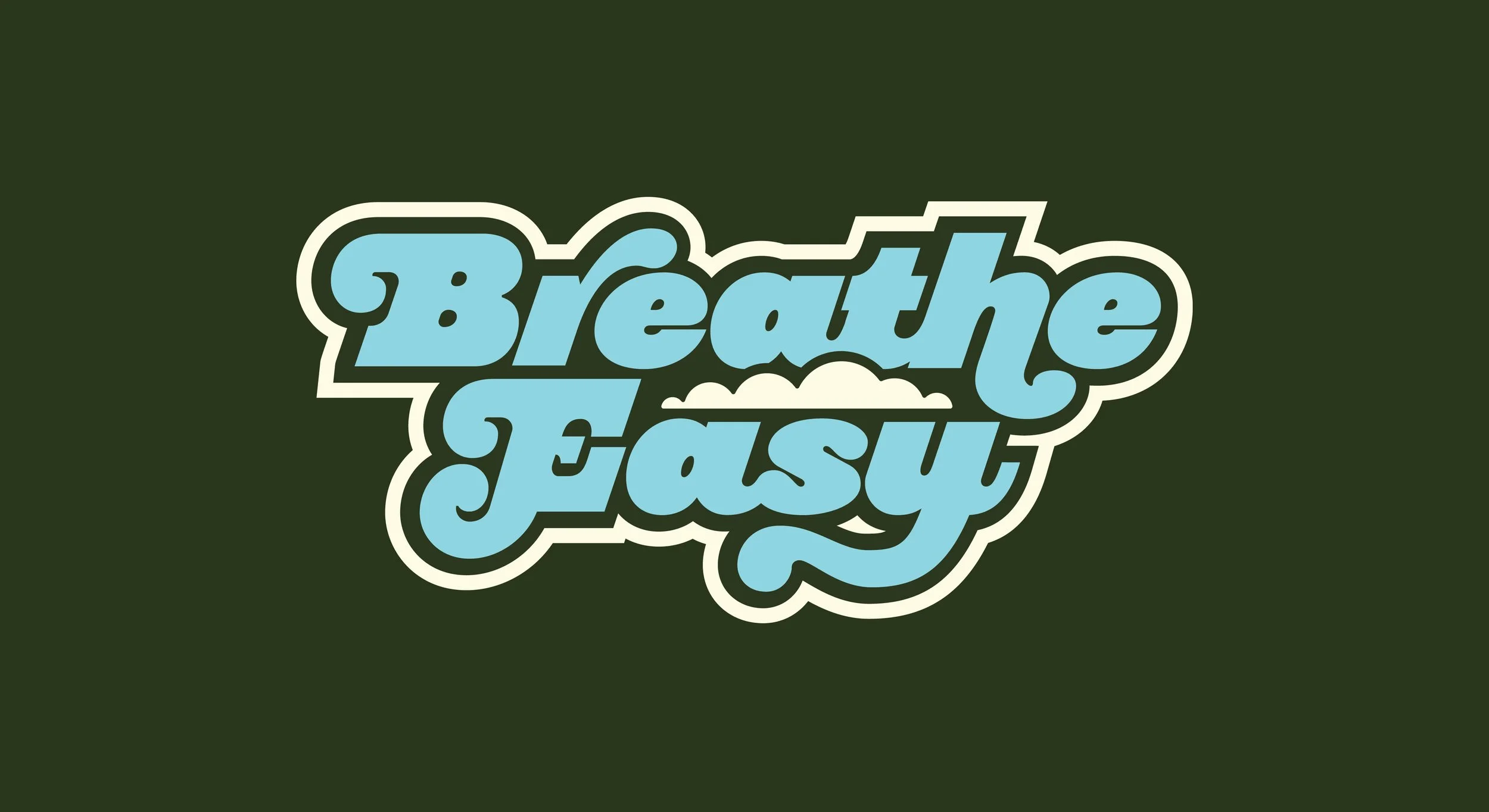
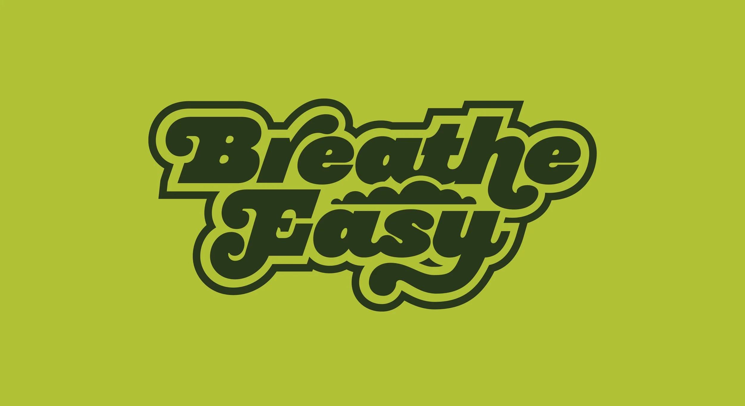
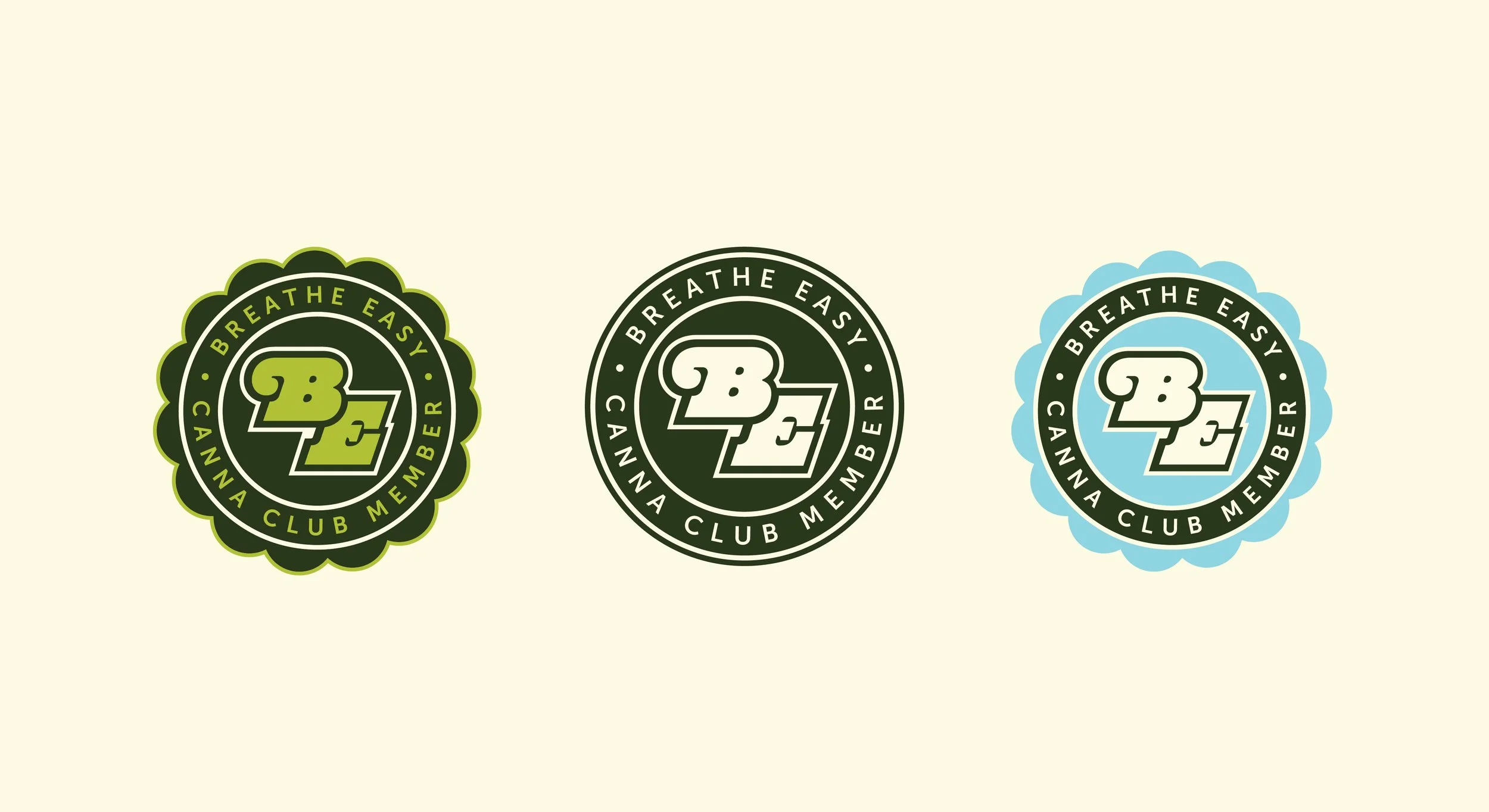
Together, we built a brand identity rooted in approachability and cultural authenticity. We used an earthy, vintage color palette with bold, curvy typography that feels inviting rather than sterile. Their imagery showcases diversity that reflects their actual community, something corporate cannabis companies rarely get right.
The result balances serious expertise with a rejection of the overly medical, culture-stripped vibe of big dispensaries. It's instantly recognizable but uniquely Breathe Easy.